Case Study: Over The Net Pins
Overview
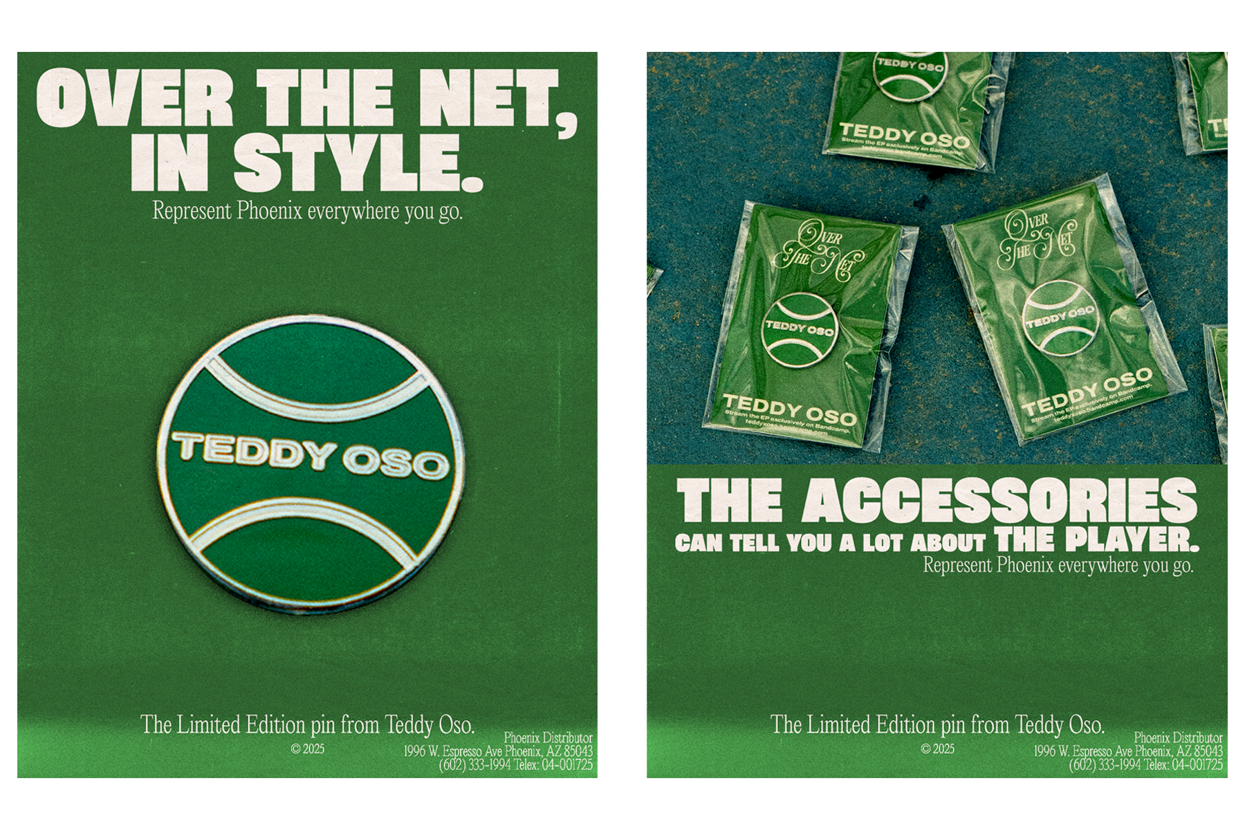
For the release of Over The Net, I designed enamel pins as a merchandise item. The goal was to create a design that captured the EP’s tennis-inspired theme while staying true to the artist’s visual identity.
Concept Development
Started by analyzing the EP artwork and branding.
Identified tennis elements (ball, court lines, movement) as key motifs.


Design Execution
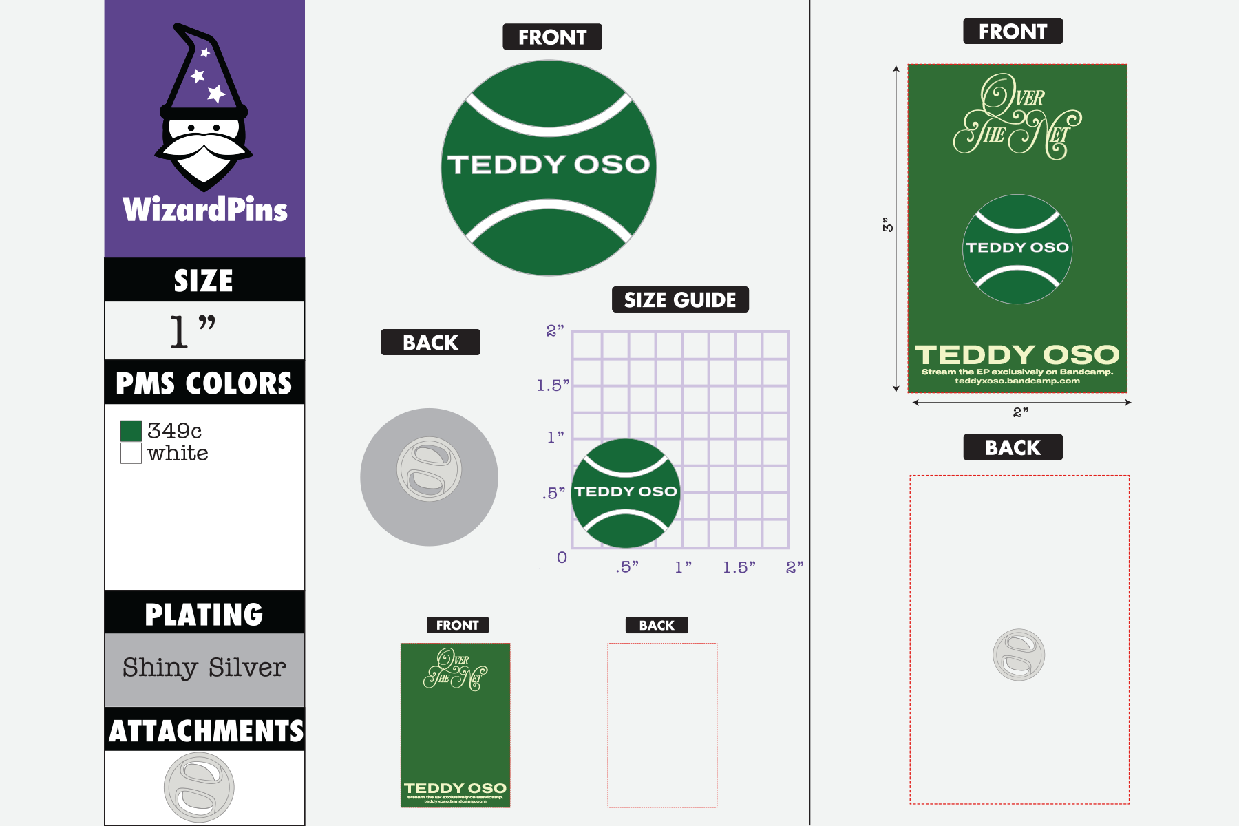
Created the artwork in Adobe Illustrator for precision and scalability.
Explored multiple typography placements within the tennis ball to balance clarity and aesthetics.
Integrated the artist’s name within the tennis ball, making it both a functional and symbolic design element.

Production Setup
Used Wizard Pins’ size and template guidelines to build mockups.
Ensured artwork aligned with enamel pin manufacturing specs (strokes, spacing, fills).
Generated digital mockups to preview how the pin would look in real life.
Final Design
The result is a clean, bold enamel pin that reflects the tennis theme of the EP.
The design embeds the artist’s identity directly into the visual.